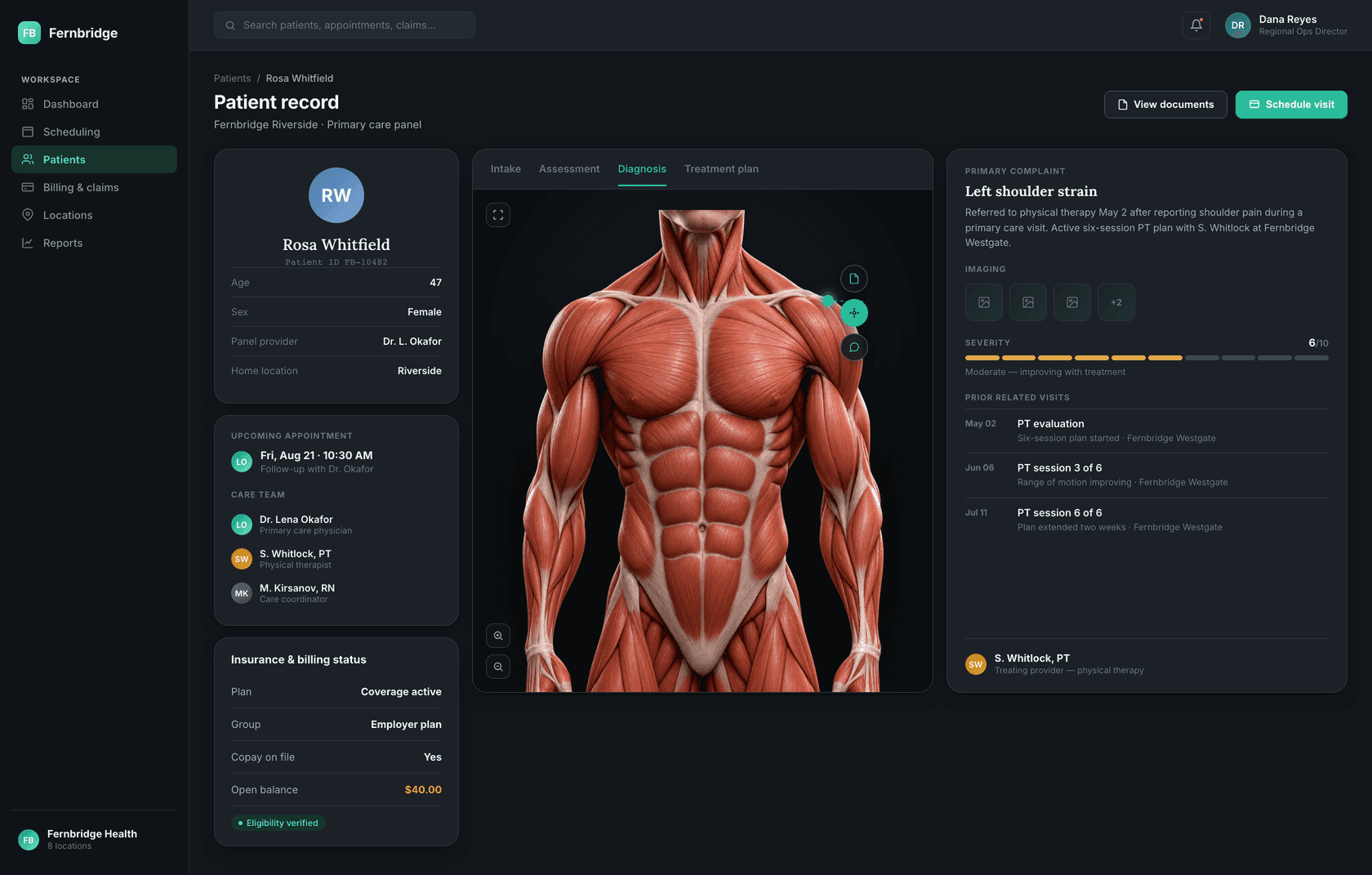
Fernbridge Health gives providers a real visual read on a patient's condition — primary complaint, severity and visit history laid out around the body itself, not buried in a form — while the same system runs scheduling, billing and a patient app across all 8 locations.
A clinic group that grows past a couple of locations usually inherits its systems the same way: a generic EHR's built-in calendar for scheduling, a spreadsheet somewhere for the things the calendar can't do, and sticky notes for everything that falls through both. It holds together at one site. Add a physical therapy location, an urgent care, a second primary care office, and the cracks start showing — a patient's history splits across clinics that don't share a record, a no-show at one site looks nothing like a no-show at another, and nobody has one number for how the network is actually doing today.
Fernbridge Health is built around the opposite bet: that a multi-location outpatient business — physical therapy, urgent care and primary care under one roof — can run on a single, calm, well-designed system instead of three tools stitched together with phone calls. A network dashboard that answers "how's today going" in one glance. A real day-view scheduling board across providers, rooms and locations, not a single-clinic calendar stretched thin. A patient record with one visit-history timeline instead of a different paper chart at every site. A claims queue with denial rate and A/R aging in view, because a scheduling app that ignores billing has only solved half the problem. And one patient-facing surface — a telehealth visit, a waiting room, a message from the care team — so a patient doesn't have to call the front desk for something their phone should already show them.
We designed and built Fernbridge Health in house — the staff-facing scheduling, records and billing surfaces, modeled against a realistic 8-location clinic group, plus the one patient-facing telehealth screen. It's deliberately the healthcare entry in this portfolio: proof that "calm and clinical" doesn't have to mean sterile, and that dense operational software can still feel unhurried.
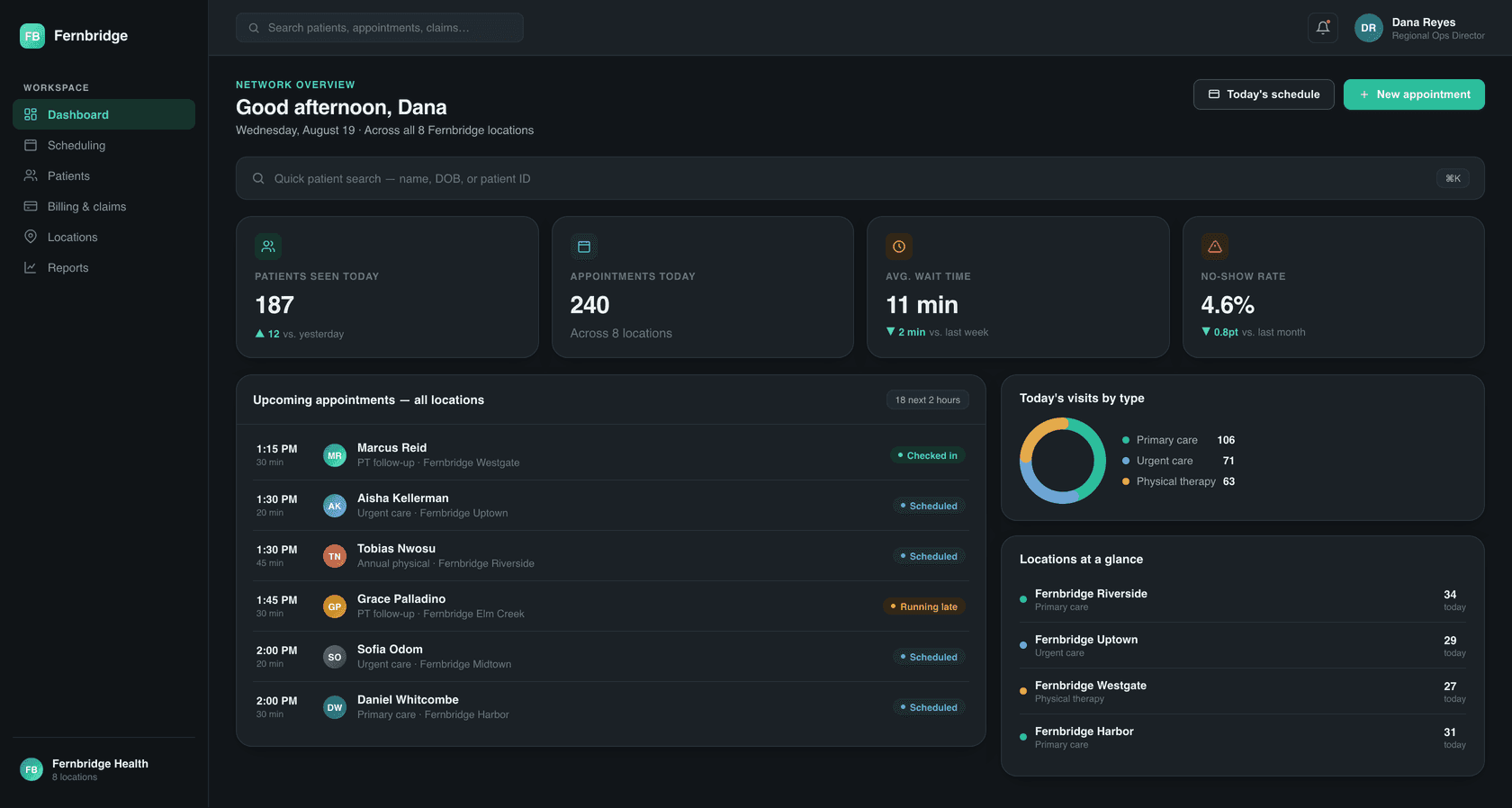
Today's appointments, no-show rate and wait times across every location in one view — the numbers a regional director actually opens at lunch.
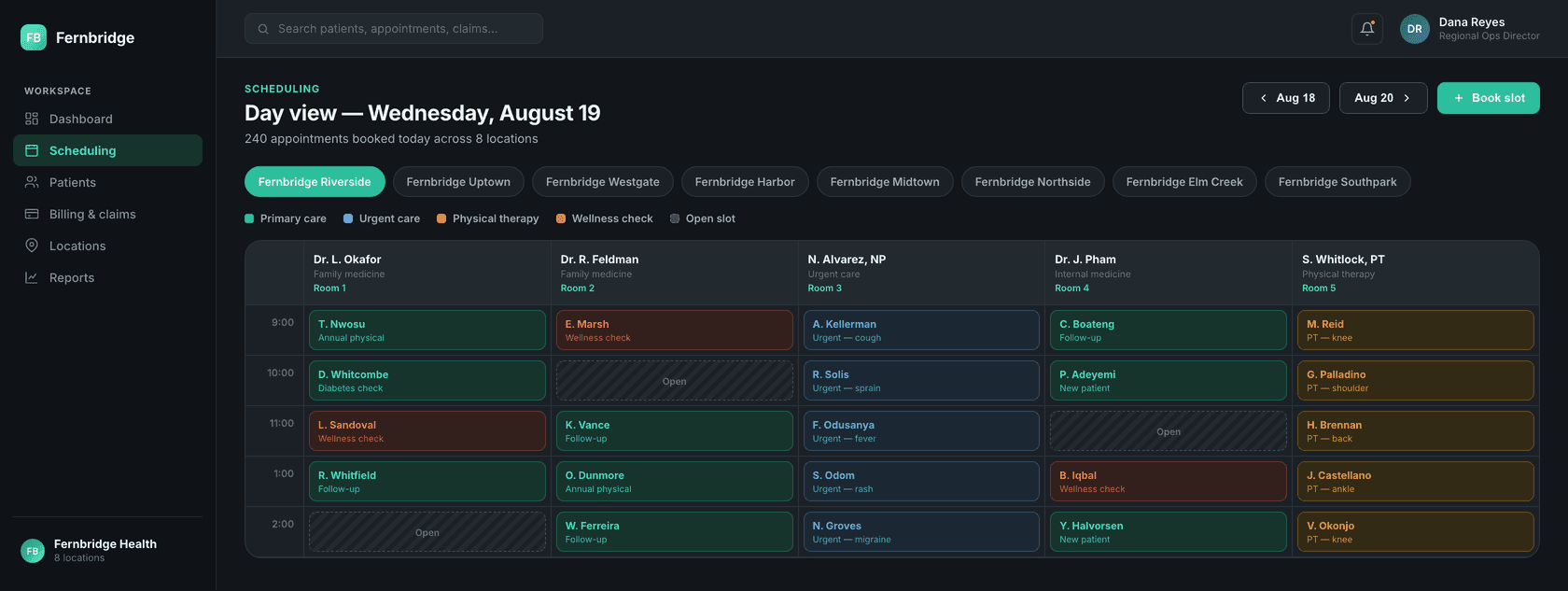
A real day-view board — providers, rooms and visit type, color-coded, across all 8 locations, not a single-clinic calendar stretched thin.
Demographics, insurance status and a full visit-history timeline across every location a patient has ever walked into, in one chart.
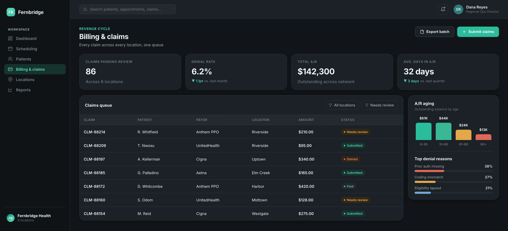
A real claims queue — denial rate, A/R aging and top denial reasons — the operational half of practice management that a scheduling app alone doesn't solve.
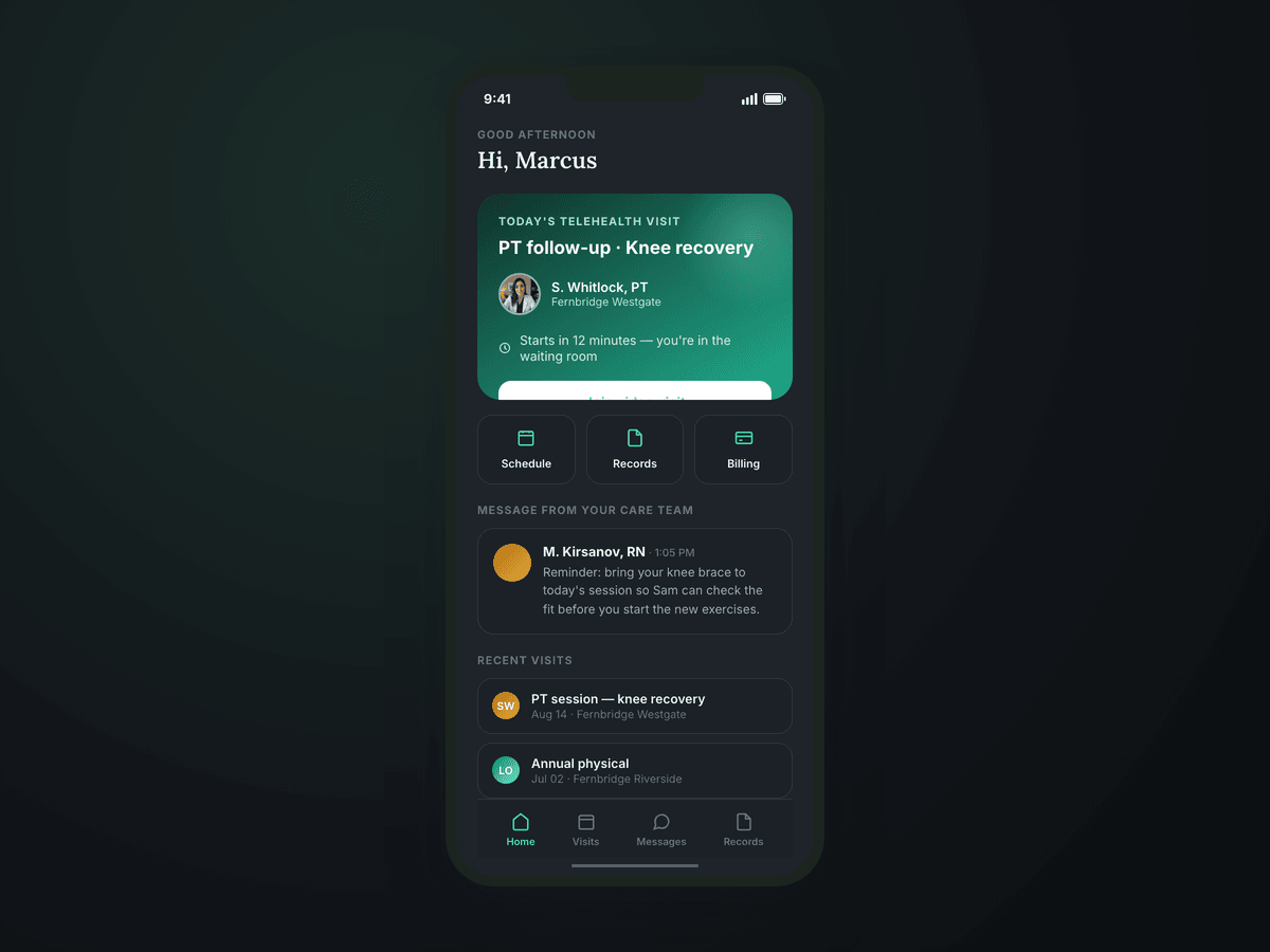
The one patient-facing surface: today's video visit, a waiting-room status, and a message from the care team, without a phone call to the front desk.
Eight locations and hundreds of daily appointments modeled as real data from the first screen, not a two-provider demo.
“The visual system had to hold together across a dense scheduling board, a claims queue and a patient's phone screen — calm and clinical everywhere, sterile nowhere.”